Streaming-Style Video Hub for the Cleveland Browns
project overview
Transforming a simple video feed into a dynamic, streaming-style hub that reimagines how fans discover and watch Browns video content.
project type
UX/UI Design
timeline
Apr - Aug 2025
client
Cleveland Browns
my role
Lead Designer

Challenge
The app’s original video section displayed content in a basic chronological feed. With an extensive catalog spanning interviews, highlights, podcasts, and short-form clips, this layout failed to surface the depth and variety of content available.
Goal: Create a structured, engaging video hub that encourages exploration, repeat visits, and longer watch sessions.
Research & Discovery
I started by analyzing video experiences from both NFL team apps and mainstream streaming platforms to identify navigation models, categorization strategies, and interaction patterns.
Key findings included:
NFL apps often segmented content into sections like Latest Videos, Series, and Short-Form, but execution varied.
Streaming platforms offered useful visual and UX cues, but their long-form focus didn’t translate directly to our blend of individual videos and short series.
After aligning internally, I met with the Video team to understand pain points and publishing workflows. Their main feedback:
Fans needed more visibility into short-form and podcast content.
There was no easy way to explore full series or older videos.
Content should shift seasonally to stay relevant.

the original video page alongside early iterations
Approach
Navigation and Information Architecture
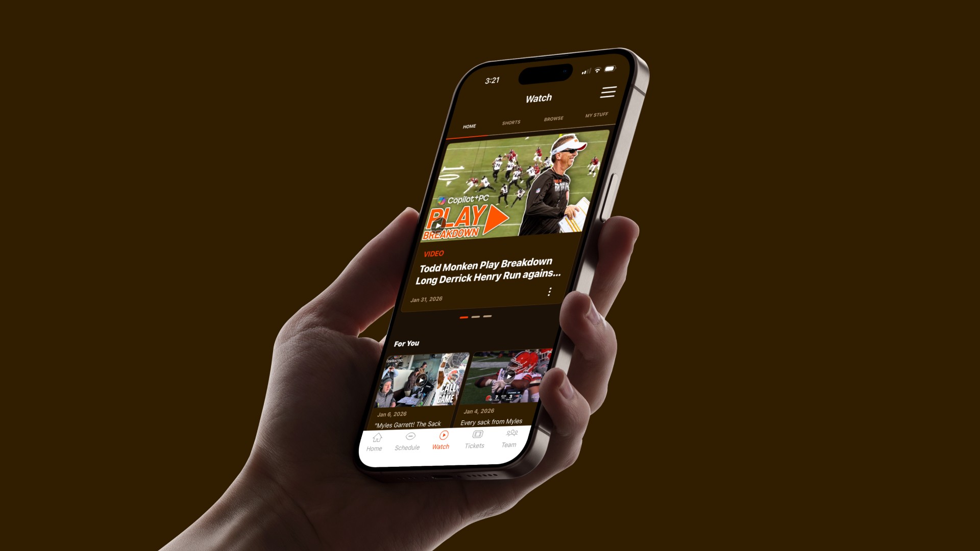
The new hub introduces a top navigation bar, offering quick access to four main areas:
Home: Highlights recent uploads, personalized recommendations, and featured series — prioritizing relevance and freshness.
Shorts: A dedicated space for vertical short-form videos, giving visibility to fast-growing content types.
Browse: Curated by categories such as Most Popular, Game Coverage, Interviews & Analysis, and Behind the Scenes, with dedicated carousels for formats like Shorts and Podcasts.
My Stuff: Personalized for logged-in users, featuring Bookmarks, Continue Watching, and Recently Watched videos.
Clicking any series thumbnail opens a modal with all episodes, allowing seamless browsing without leaving the main page.
Personalization
Previously, fans could bookmark videos, but those lived in isolation. The new hub centralizes and expands this functionality with:
Bookmarks
Continue Watching
Recently Watched
Recommended Videos
This makes the experience feel more personal, dynamic, and responsive to user habits.
Immersive Viewing
I introduced a dark theme to signal a shift in context — fans enter a focused, content-first environment. The darker palette draws attention to thumbnails and motion while mirroring the cinematic tone of familiar streaming experiences.
The result feels premium, immersive, and intentionally distinct from the rest of the app.


Solution
The new Video Hub centralizes all Browns video content including highlights, interviews, short clips, and exclusive series into one cohesive experience designed for both quick browsing and deep dives.
Since launch:
+95% increase in in-app video views
+29% increase in video starts
+16% increase in average dwell time
Over 50% of homepage modules now exceed a 2% CTR
A couple things I learned:
Design around limitations - We initially planned to integrate YouTube Shorts directly into our native vertical player, but technical limitations required a pivot. Embedding the Shorts webpage preserved visual continuity while simplifying management for the video team.
Build for flexibility - Video output fluctuates throughout the season. Categories on the Browse page were intentionally broad, ensuring the layout still feels balanced during low-content periods and doesn’t create empty carousels or long scrolls.
Balance user needs and team workflows - Aligning design decisions with the Video team’s publishing process ensured the final experience was not just fan-friendly but also sustainable and scalable behind the scenes.