Site Redesign for Huntington Bank Field
project overview
I led the full redesign and rebuild of the Huntington Bank Field website for the Cleveland Browns, creating a cleaner, more consistent, and event-focused experience. The new site improved usability, increased engagement by 20%, and streamlined content management for internal teams.
project type
Web Design
timeline
Feb - Aug 2025
client
Cleveland Browns
my role
Lead Designer

Problem
The previous site was outdated, slow, and inconsistent. Fans struggled to find accurate information because pages often contained conflicting content, a result of the backend structure. On top of that, event pages were inflexible, limiting how information could be displayed.
The team needed a site that:
Highlighted stadium events and private rental opportunities
Provided accurate, easy-to-navigate information
Allowed internal staff to update content quickly and consistently

the original homepage and event page, highlighting some of the styling issues
Approach
My approach focused on simplifying navigation, organizing content around fan needs, and establishing a consistent visual system.
Navigation & Information Architecture
The original site had inconsistent labels, buried information, and redundant pages. I reorganized the structure to align with real user behavior:
Introduced clearer navigation groups, including a dedicated Connect section and an expanded footer.
Added high-visibility pages for Clear Bag Policy & Prohibited Items, and Lost & Found, reducing common user friction points.
Reworked key areas, including Seating Maps, Ticket Information, Directions & Parking, to reflect actual fan decision paths.
Built a filterable concessions matrix to replace static lists and answer frequent guest questions.
Simplified terminology and restructured the A–Z Guide to make all policies accessible at a glance.
Design System & Content Consistency
To address the lack of hierarchy and clarity, I established a cohesive design system:
Defined a clear typography and heading structure.
Rewrote dense or technical content to be fan-friendly and scannable.
Built reusable components and page templates to ensure consistency and reduce ongoing maintenance.
Event Experience & Conversion
Increasing event visibility and ticketing engagement was a key stakeholder goal. I redesigned the event flow to highlight upcoming events and streamline actions:
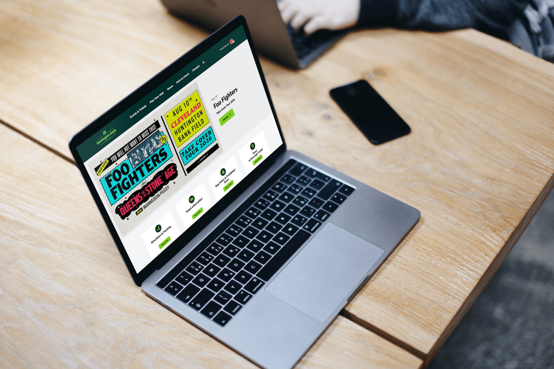
Shifted the homepage to an event-first layout with a featured slider and upcoming events feed.
Strengthened event CTAs (e.g., turning “View Detail” into “Buy Tickets” and moving ticket links above the fold).
Added a Request Info pathway for suites and rentals, with auto-populated inquiry forms to reduce friction.


Impact
These improvements led to measurable gains: search impressions increased by 71% due to stronger SEO and heading structure, time on site rose 8%, bounce rates dropped 9%, and users viewed 2% more pages per session. Event booking and premium hospitality inquiries now convert at over 3%, demonstrating the effectiveness of the new calls-to-action.
Reflection
Lead with content: For a content-heavy site, structure and clarity matter more than flashy visuals. Once the information was organized and rewritten, design decisions naturally supported usability.
Advocate for usability: Stakeholder preferences don’t always align with user needs. I learned to challenge assumptions respectfully and show data-driven alternatives that achieved the same goals with better flow.